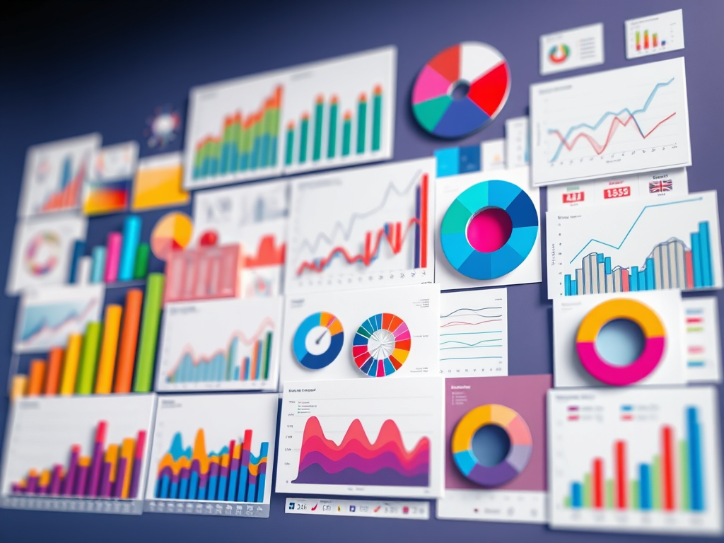
Let’s talk charts. Bar charts, line graphs, pie slices, scatter blobs — they all have their place, but picking the wrong one can turn your beautiful data into a confusing mess. So how do you know which one to use?
Don’t worry — this isn’t a lecture. Think of it as a cheat sheet for telling your data’s story the right way.
Bar Charts: The MVP of Comparisons
If your data is begging you to answer “which is bigger?” or “who did it best?”, a bar chart has your back. Horizontal or vertical, it’s perfect for comparing categories like:
Monthly sales by region
Favorite ice cream flavors
Number of tantrums per weekday (we see you, Tuesday)
📌 Use when: You’re comparing distinct groups or categories.
Line Charts: Spotting the Trends
Line charts are like the mood rings of data — they help you track how things change over time. Whether it’s website traffic, stock prices, or baby nap patterns, if you’re watching something go up and down, a line chart is your go-to.
📌 Use when: You want to show trends or patterns over time.
Pie Charts: A Slice of the Whole
A good pie chart shows parts of a whole, but only when you’ve got a few simple categories. Anything more than 5–6 slices and it starts to look like abstract art.
📌 Use when: You’re showing percentages or proportions that add up to 100%.
⚠️ Skip it when: You have too many categories or tiny slivers that no one can read.
Scatter Plots: Finding Relationships
Scatter plots are like relationship therapists for your data. They show how two things are related (or not). For example:
Does screen time affect bedtime? Does coffee consumption predict productivity?
📌 Use when: You want to see correlation or spot clusters/outliers.
Histograms: Understanding Distributions
Histograms look like bar charts, but they show how data is distributed — like how many people fall into certain age ranges or how long most people spend on your website.
📌 Use when: You’re showing frequency of something within ranges.
Heatmaps, Treemaps & Beyond
Feeling fancy? Heatmaps and treemaps are great for more complex datasets. They’re visual ways to show intensity, size, or hierarchy — like which website pages get clicked the most or which departments spend the most money.
📌 Use when: You’ve got layered or detailed data, and color can help guide the story.
Final Tip: Simplicity Wins
No matter what chart you choose, keep it clean, clear, and to the point. Don’t overload it with colors, labels, or dramatic 3D effects (we’re looking at you, Excel 2003).
✨ The goal isn’t just to make a chart — it’s to make your data make sense. And that’s what turns numbers into human-friendly stories.
Stay curious ✨

Leave a comment