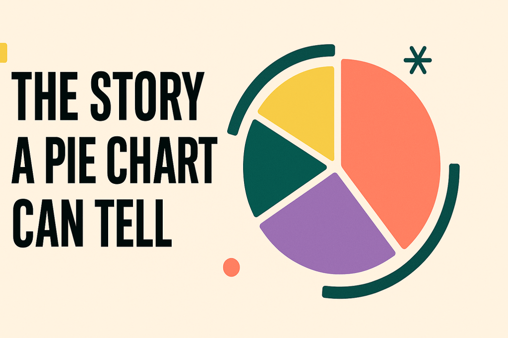
Let’s be honest — pie charts don’t always get the respect they deserve. People love to drag them for being basic or not “serious” enough, but sometimes simple is exactly what you need. At a glance, a pie chart shows you who’s taking up the most space — whether that’s in your budget, your time, or your snack drawer. No frills, just facts (and maybe a little judgment).
What pie charts do best is show proportions. They answer questions like:
What’s taking up most of the space?
What’s barely showing up?
What category is quietly draining your soul and your wallet in equal parts?
Think about your monthly spending.
Rent? Probably taking up half the circle.
Groceries? Decent chunk.
That random subscription you forgot you had since 2021? Tiny slice, still hanging in there.
Suddenly, your life has a shape — and it’s not as cute as you hoped.
Pie charts work because they give you a quick visual of the whole picture. They’re especially useful when you want to compare a few categories without making someone scroll through a wall of numbers. It’s like a snapshot of priorities, whether you’re analyzing your spending or the percentage of your day spent saying “just one more episode.”
Now, are pie charts perfect? Absolutely not. If you’ve got 12 different categories fighting for attention, the chart turns into chaos real quick. And if you have to include a slice called “other,” that’s basically code for “we gave up.”
But when you keep it simple, a few clear slices, a focused message, pie charts actually tell a pretty solid story. They’re straightforward, familiar, and surprisingly effective when you don’t overcomplicate them.
So next time someone rolls their eyes at a pie chart, just nod, smile, and let the data speak for itself. Or better yet… show them the chart. If nothing else, it’ll make them hungry. 🥧😂
Stay curious

Leave a comment