
Charts are everywhere. They’re in the news, on social media, in your budget app, and even your fitness tracker. While they look helpful… sometimes they feel more like a pop quiz you didn’t study for. 😅
Don’t worry — you don’t need to panic when you see a bar graph or a line chart. You just need a few simple tools to read them with confidence. Let’s break it down, step by step.
📊 Why Do Charts Even Exist?
Charts are just a way to show information visually so your brain can make sense of it faster.
Instead of reading a paragraph that says,
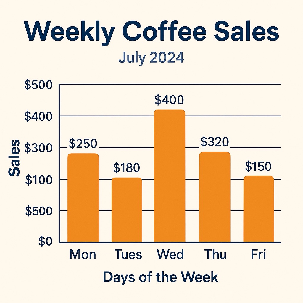
“Over the last five days, coffee sales went from $250 to $400, then dropped to $150…”
You get a quick image that shows the ups and downs — and you instantly see the pattern.
🧠 Step 1: Start with the Title
Before anything else, read the title of the chart. It usually tells you:
What the chart is about
What’s being measured
What time frame it covers
Example:
“Weekly Coffee Sales – July 20254”
Now you know: It’s about coffee sales, and it’s showing you what happened over the past week.
🏷️ Step 2: Look at the Labels
Next, check the axes (those lines on the sides of the chart).
The x-axis (horizontal line) usually shows time or categories (like days of the week or types of drinks) The y-axis (vertical line) usually shows the numbers being measured (like dollars, steps, or hours)
💡 Pro tip: If you’re ever confused, just ask, “What is this line trying to show me?”
📈 Step 3: Follow the Shape
Line chart? Look for movement: Is it going up, down, or staying flat?
Bar chart? Compare the lengths: Which bar is tallest? Which is shortest?
Pie chart? Notice the size of the slices: What takes up the most space?
You’re not looking for perfection — just patterns.
🔍 Step 4: Ask “What’s the Point?”
Instead of trying to absorb everything, ask:
What’s the overall trend?
What’s the biggest thing that stands out?
What does this tell me about what’s happening?
Example:
If you see that coffee sales spike on Wednesday, now you know that’s the day people are reaching for their caffeine fix. ☕
🧃 Real-Life Example
Let’s say your phone shows you your screen time for the week.
You might see a bar chart like this:
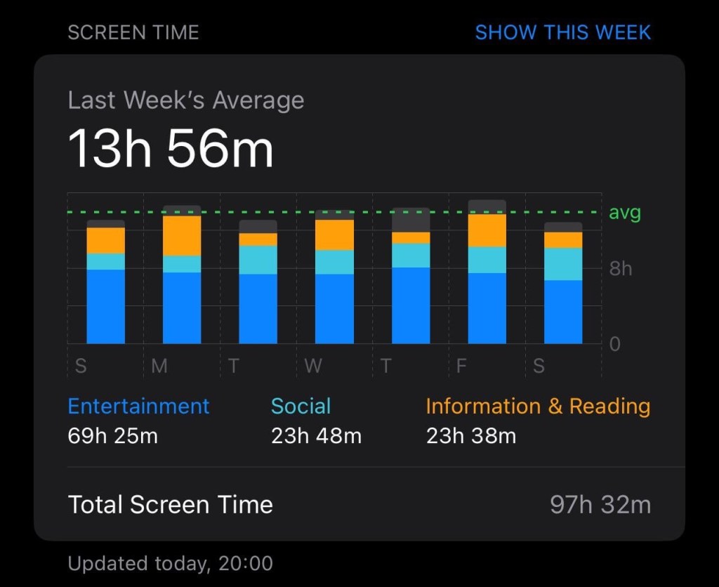
➡ The tallest bar is on Friday.
✅ That tells you that Friday is your scroll-happy day.
You didn’t need math — just a quick scan for the tallest bar.
😌 You’ve Got This
Reading a chart doesn’t mean memorizing terms or doing equations. It’s about getting the story behind the picture. Start with the title, check the labels, and ask what it’s trying to tell you.
And if it still feels confusing? That’s totally okay. The more you practice looking at visuals like this, the easier it gets.
Stay curious,
Sydney

Leave a comment